Lesson 10: Filter "Outliers" with Huge Salaries
Next, we need to find out if there are data rows that really "stand out" and would lower the data quality.
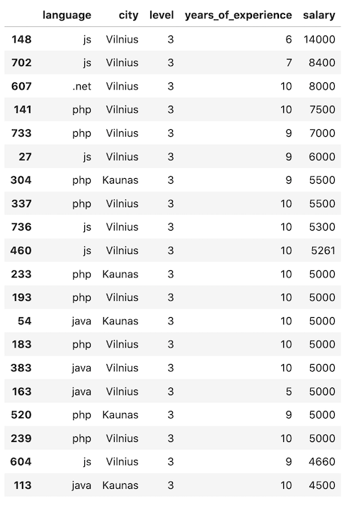
Let's look at the biggest salaries from the survey:
main.py
1# ...2 3print(df.shape)4 5df_sorted = df.sort_values(by='salary', ascending=False)6print(df_sorted.head(20))Result:
Notice: as you can see, I used a separate df_sorted variable in this case because it's just a temporary dataset for us to evaluate the distribution. Later, we move on with df again.
So, what can we see here?
Many earn 4500-5500 Eur per month, but the "jumps" to bigger salaries are uneven. One person has 6000, one has 7000, and a few have even bigger salaries.
Again, you can draw the line and eliminate some of those outliers.
To make a choice a bit easier, let's represent it on a graph with matplotlib. Let's take years of experience as x value and salary as y value and see how many dots are clearly outside of the main distribution.
main.py
1# ... 2 3print(df_sorted.head(20)) 4 5x = df.iloc[:, -2:-1] 6y = df.iloc[:,-1].values 7plt.xlabel('Years of experience') 8plt.ylabel('Salary') 9plt.scatter(x, y)10plt.show()Result:
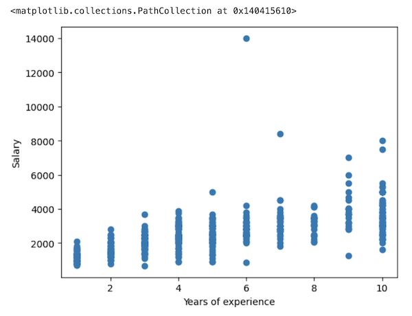
Visually, I see two dots that need to be eliminated: the ones with salaries of 14000 and 8400.
With others, it's a personal choice, but I think those 6000+ would also not help the predictions to be accurate, as they are further from their "column friends".
So, my decision of filter is to include all rows only up to the salary of 6000:
main.py
1# ...2 3plt.show()4 5df = df[df['salary'] <= 6000]6print(df.shape)7 8# Result: (518, 5)Also, let's try to redraw the graph:
main.py
1# ... 2 3print(df.shape) 4 5x = df.iloc[:, -2:-1] 6y = df.iloc[:,-1].values 7plt.xlabel('Years of experience') 8plt.ylabel('Salary') 9plt.scatter(x, y)10plt.show()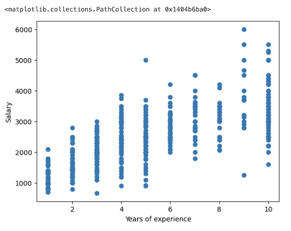
It looks much better now, and we can visually draw an almost straight line of linear regression from the bottom left to the top right.
Ok, this is our final number of rows for the modeling: after all the filters, we are left with 518 rows out of the initial 760.
This is a good example of how much of the data may be "useless" when you get it in raw format from the real world.
If we didn't perform that filtering, the accuracy of predictions would drop significantly, and I will show it to you in the later lesson.
In the next lesson, we will transform the String values into Numeric, to be able to use them for the model.
Final File
If you felt lost in the code above, here's the final file with all the code from this lesson:
main.py
1import pandas as pd 2import numpy as np 3import matplotlib.pyplot as plt 4import seaborn as sns 5 6df = pd.read_csv('salaries-2023.csv') 7 8print(df.head()) 9print(df.shape)10df.info()11print(df.describe())12 13allowed_languages = ['php', 'js', '.net', 'java']14df = df[df['language'].isin(allowed_languages)]15 16vilnius_names = ['Vilniuj', 'Vilniua', 'VILNIUJE', 'VILNIUS', 'vilnius', 'Vilniuje']17condition = df['city'].isin(vilnius_names)18df.loc[condition, 'city'] = 'Vilnius'19 20kaunas_names = ['KAUNAS', 'kaunas', 'Kaune']21condition = df['city'].isin(kaunas_names)22df.loc[condition, 'city'] = 'Kaunas'23 24print(df.city.value_counts())25 26allowed_cities = ['Vilnius', 'Kaunas']27df = df[df['city'].isin(allowed_cities)]28print(df.shape)29 30df_sorted = df.sort_values(by='salary', ascending=False)31print(df_sorted.head(20))32 33x = df.iloc[:, -2:-1]34y = df.iloc[:, -1].values35plt.xlabel('Years of experience')36plt.ylabel('Salary')37plt.scatter(x, y)38plt.show()39 40df = df[df['salary'] <= 6000]41print(df.shape)42 43x = df.iloc[:, -2:-1]44y = df.iloc[:, -1].values45plt.xlabel('Years of experience')46plt.ylabel('Salary')47plt.scatter(x, y)48plt.show()- Intro
- Example 1: More Simple
- Example 2: More Complex
No comments or questions yet...