Lesson 12: Correlation Heatmap
Next, we must decide what our independent variables (or features) will be.
Do We Need All Columns For x?
The answer to the question above looks simple: everything except salary, right?
- Programming language
- City
- Level
- Years of experience
But actually, the question is how much the salary really depends on any of those variables.
In other words, we should raise this question:
Is the salary bigger/smaller based on the programming language? On the city? On the level? On the years of experience?
We may find out that some of those values have a very low correlation with the salary.
To help us see it clearly, there's a great feature of the seaborn library called correlation heatmap.
In the earlier lesson, we imported the library with import seaborn as sns on top, so now we an call it like this:
main.py
import seaborn as sns# ... print(df.head(10)) sns.heatmap(df.corr(), annot=True)plt.show()Here's the result:
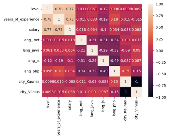
It looks cool, but... what does it actually mean? How to read it?
How To Read Correlation Heatmap
This is a matrix of columns, each cell representing the correlation of one column value to other column values.
The correlation numbers are from -1 to 1, and we're looking for numbers as close to 1. This means the strongest correlation.
And the opposite is also true: we're looking for numbers close to 0. They mean that this particular column combination does NOT have almost any correlation, and we can almost safely drop those columns from the model.
This color scheme means that the lighter the cell is, the more significant the correlation the columns have with each other.
Naturally, the correlation of a column to itself is always 1.
Also, the correlation of the column with two possible values is always -1: if the city is Vilnius, it means it's always not Kaunas.
But then, between other columns, we need to identify the strongest correlations for the salary column we want to predict.
Looking at Correlations with Salary
We need to look at the salary column and see which rows have the lightest color and the highest numbers.
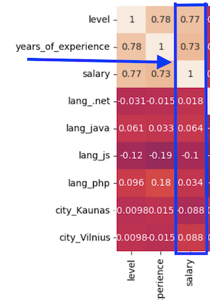
The correlation of 0.77 or 0.73 is a pretty strong one. It means that salary depends quite strongly on the years of experience and the level.
But the numbers for other columns are extremely low: 0.06, 0.01, or even negative. It means that those columns almost don't affect the salary.
Yes, it may surprise some of you, but salary doesn't depend strongly on the programming language or the city you live in. At least in this survey of local developers in Lithuania.
That means we can drop city and programming language columns and take only years of experience and level as x values, as they are the only ones with solid correlation.
main.py
# ... x = df.iloc[:,0:2].values # we take only years and level y = df.iloc[:,2].values # we take the salaryprint(x[0:5])main.py
# Result:([[ 3, 10], [ 3, 10], [ 3, 10], [ 2, 4], [ 1, 1]])main.py
# ... print(y[0:5])main.py
# Result:([2800, 3400, 2500, 2100, 3500])Ok, we got rid of a few columns. But does that also mean that all the previous work filtering out the cities and languages was kind of pointless? No, not at all. Without that initial analysis, we couldn't come to this conclusion.
I will also note that many more transformations may be needed to prepare the data. In other tutorials/courses, you may find things like data scaling, feature engineering, etc. They were just not required for this particular case.
Ok, great, now we can finally build our model in the next lesson.
Final File
If you felt lost in the code above, here's the final file with all the code from this lesson:
main.py
import pandas as pdimport numpy as npimport matplotlib.pyplot as pltimport seaborn as sns df = pd.read_csv('salaries-2023.csv') print(df.head())print(df.shape)df.info()print(df.describe()) allowed_languages = ['php', 'js', '.net', 'java']df = df[df['language'].isin(allowed_languages)] vilnius_names = ['Vilniuj', 'Vilniua', 'VILNIUJE', 'VILNIUS', 'vilnius', 'Vilniuje']condition = df['city'].isin(vilnius_names)df.loc[condition, 'city'] = 'Vilnius' kaunas_names = ['KAUNAS', 'kaunas', 'Kaune']condition = df['city'].isin(kaunas_names)df.loc[condition, 'city'] = 'Kaunas' print(df.city.value_counts()) allowed_cities = ['Vilnius', 'Kaunas']df = df[df['city'].isin(allowed_cities)]print(df.shape) df_sorted = df.sort_values(by='salary', ascending=False)print(df_sorted.head(20)) x = df.iloc[:, -2:-1]y = df.iloc[:, -1].valuesplt.xlabel('Years of experience')plt.ylabel('Salary')plt.scatter(x, y)plt.show() df = df[df['salary'] <= 6000]print(df.shape) x = df.iloc[:, -2:-1]y = df.iloc[:, -1].valuesplt.xlabel('Years of experience')plt.ylabel('Salary')plt.scatter(x, y)plt.show() one_hot = pd.get_dummies(df['language'], prefix='lang')df = df.join(one_hot)df = df.drop('language', axis=1) one_hot = pd.get_dummies(df['city'], prefix='city')df = df.join(one_hot)df = df.drop('city', axis=1) print(df.head(10)) sns.heatmap(df.corr(), annot=True)plt.show() x = df.iloc[:, 0:2].values # we take only years and levely = df.iloc[:, 2].values # we take the salaryprint(x[0:5]) print(y[0:5])- Intro
- Example 1: More Simple
- Example 2: More Complex
No comments or questions yet...