Lesson 10: Styling the JavaScript Widget
To style our widget, create a new file called assets.js and add the following code that does the following:
- Exports
stylesconstant, which we will use to inject styles into the head of the document - Exports
MESSAGE_ICONconstant, which is an SVG icon for the message icon - Exports
CLOSE_ICONconstant, which is an SVG icon for the close icon
You can later change the styles however you want, but for now, this is the default styling we will use.
assets.js
export const styles = ` .widget__container * { box-sizing: border-box; } h3, p, input { margin: 0; padding: 0; } .widget__container { box-shadow: 0 0 18px 8px rgba(0, 0, 0, 0.1), 0 0 32px 32px rgba(0, 0, 0, 0.08); width: 400px; overflow: auto; right: -25px; bottom: 75px; position: absolute; transition: max-height .2s ease; font-family: Helvetica, Arial ,sans-serif; background-color: #e6e6e6a6; border-radius: 10px; box-sizing: border-box; } .widget__icon { cursor: pointer; width: 60%; position: absolute; top: 18px; left: 16px; transition: transform .3s ease; } .widget__hidden { transform: scale(0); } .button__container { border: none; background-color: #0f172a; width: 60px; height: 60px; border-radius: 50%; cursor: pointer; } .widget__container.hidden { max-height: 0px; } .widget__header { padding: 1rem 2rem 1.5rem; background-color: #000; color: #fff; border-top-left-radius: 10px; border-top-right-radius: 10px; text-align: center; } .widget__header h3 { font-size: 24px; font-weight: 400; margin-bottom: 8px; } form { padding: 2rem 1rem 1.5rem; } form .form__field { margin-bottom: 1.5rem; display: flex; flex-direction: column; } .form__field label { margin-bottom: 8px; font-size: 14px; } .form__field input, .form__field textarea { border: 1px solid #000000ad; border-radius: 3px; padding: 8px 10px; background-color: #fff; } .form__field input { height: 48px; } .form__field textarea::placeholder { font-family: Helvetica, Arial ,sans-serif; } form button { height: 48px; border-radius: 6px; font-size: 18px; background-color: #000; color: #fff; border: 0; width: 100%; cursor: pointer; } form button:hover { background-color: rgba(0, 0, 0, 95%); } /* Chat containers */.container { border: 2px solid #dedede; background-color: #f1f1f1; border-radius: 5px; padding: 10px; margin: 10px 0;} /* Darker chat container */.darker { border-color: #ccc; background-color: #ddd;} /* Clear floats */.container::after { content: ""; clear: both; display: table;} /* Style images */.container img { float: left; max-width: 60px; width: 100%; margin-right: 20px; border-radius: 50%;} /* Style the right image */.container img.right { float: right; margin-left: 20px; margin-right:0;} /* Style time text */.time-right { float: right; color: #aaa;} /* Style time text */.time-left { float: left; color: #999;} .widget__messages_box { margin: 0px 15px; height: 400px; overflow-y: scroll;}`; export const MESSAGE_ICON = ` <svg xmlns="http://www.w3.org/2000/svg" width="32" height="32" viewBox="0 0 32 32" fill="none" stroke="#FFFFFF" stroke-width="2" stroke-linecap="round" stroke-linejoin="round" class="feather feather-mail"> <path d="M4 4h16c1.1 0 2 .9 2 2v12c0 1.1-.9 2-2 2H4c-1.1 0-2-.9-2-2V6c0-1.1.9-2 2-2z"></path> <polyline points="22,6 12,13 2,6"></polyline> </svg>`; export const CLOSE_ICON = ` <svg xmlns="http://www.w3.org/2000/svg" width="32" height="32" viewBox="0 0 32 32" fill="#FFFFFF" stroke="#FFFFFF" stroke-width="2" stroke-linecap="round" stroke-linejoin="round" class="feather feather-x"> <line x1="18" y1="6" x2="6" y2="18"></line> <line x1="6" y1="6" x2="18" y2="18"></line> </svg>`;Next, we need to open our main.js file and add the following code:
- Import of styling
- Uncomment few lines
So, let's add the injection:
main.js
import {CLOSE_ICON, MESSAGE_ICON, styles} from "./assets.js"; class MessageWidget { // ... injectStyles() { const styleTag = document.createElement("style"); styleTag.innerHTML = styles.replace(/^\s+|\n/gm, ""); document.head.appendChild(styleTag); } // ...}Then, we can uncomment the injectStyles method in the construct method:
main.js
class MessageWidget { // ... constructor() { // ... // this.injectStyles(); // this.injectStyles(); } // ...}And uncomment the SVG icons in the createWidgetContent method:
main.js
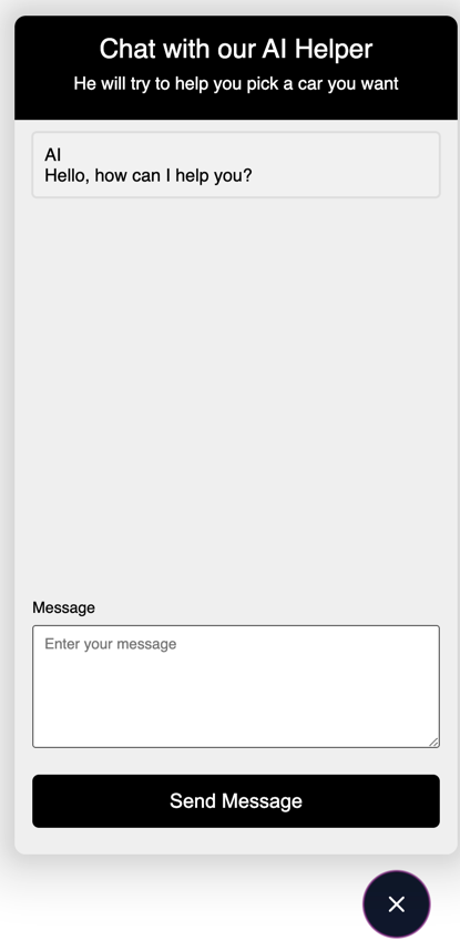
class MessageWidget { // ... createWidgetContent() { // ... // this.widgetIcon.innerHTML = MESSAGE_ICON; // this.widgetIcon.innerHTML = MESSAGE_ICON; // this.closeIcon.innerHTML = CLOSE_ICON; // this.closeIcon.innerHTML = CLOSE_ICON; // ... } // ...}Now, if we launch our project with npm run dev, we should see the widget with the new styles applied:

And if we click on it, we should see that it opens and closes as expected:
That's it. Next, we will test the widget to see if it works as expected.
Lessons
- Intro: Structure and Preparation
- AI Engine and Main Python Script
- Front-end JavaScript Widget
- Bonus
No comments or questions yet...